


Explore expert insights on website icon design, branding, and development. Learn how to elevate your website identity and stand out in the digital landscape.
Table of Contents
Introduction
When visitors land on your website icon, they form their reaction in 50 to 100 milliseconds, and your website landing page stands out loud on this. But there is still a small element present, which we name as website icon, often known as favicon, that works quietly for your website. Website icon works silently as an identity of a website that remains there whenever anyone shares a website link and information. A website icon is something that stands out above all and makes a separate identity of your website.
Whether the icon is displayed on the browser tab, saved as a bookmark on the desktop, or pasted on a mobile screen, a website icon really works well for anchoring on that basis of your website.
It acts as a generic page to instantly recognise a website. A website is well known and understood by its website icon. A website icon works really well for the website. A different icon with visuals is a must in 2026 to take your brand to another level, as now every brand is trying their own hard to make the brand visible and make it attractive. So, to make it different from others, an icon is a must.
Ways to Create a Perfect Website Icon
These are some of the perfect website icon-making tips that can help you build the best icon for your website.
Prioritise extreme simplicity.
A website icon renders at a microscopic scale and sometimes can be 16 × 16. In this situation, adding many details to one icon just makes it muddy and blurry.
To create the best identity, a website builder should avoid detailed illustrations or full-text images to make it sharp and clean. Too much detailed illustration looks unappealing and can affect people’s perspective about the website.
Sometimes, to make a website icon different, a lot of shadows, gradients, and lines are often added to them that look awful in microscopic images. These non-essential elements should be avoided so far as a website builder can be.
A lot of geometric shapes should be avoided. Instead of that, a single geometric shape with clear, small text should be there that can elevate the style of the website.Before making a website icon, a website developer should carefully analyse the Google icon, how effortlessly it is shining, instead of being simple without any geometric confusions.
Distill your website logo into a monogram or symbol.
Main website logos rarely fit into square brackets. If the full logo contains a tagline and image, then it’s hard to fit that into your image. So, instead of that, an image with a clear geometric shape should be used by a website developer. These are some of the elements and parameters that a website developer should take care of to provide the best website icon to the website owner.
INITIALS: Website developer should use the first 2 words of the brand name in the logo, as the icon is the representation of the brand. Then it is a must that the first word of the brand name should be used in the logo, like in Google. The first letter should be written in different typographic styles and colours, instead of adding many geometric images.
Brand symbol: Website developer should isolate the emblem and mark from the full logo.
Abstract motif: Create a crazy geometric image from the initial word that sounds special and looks differently amazing. It should have some remembrance of the logo.
Master high-contrast colour selection.
Browser user interfaces differ by colours also, so if your brand icon contains colour, then it should be made according to the colours that your logo and website depict. An icon should be made according to a clear colour image, like bright, dark, or more dull. It should not be made like a dull one, so it is preferred that an article must have the remembrance of the website and logo. Dark or light colour can be avoided, as the user behaviour was according to that.
Use strong complementary colour: Strong contrast of colours should be in between the images. A high contrast between the image and the background ensures clear visibility and focus.
Too light and dark: Before finalising a business website icon, it should be placed in different backgrounds, like dark, grey, and white backgrounds, and the website developer should notice how it is looking. After that, a website icon should be finalised, as a user places the icon of a website app on the desktop as a bookmark, and there it anchors on behalf of the brand.
Background container: There are chances that an icon made according to a website logo can be dark navy and black that lose visibility over dark backgrounds. In that case, a clear, light background container shape should be used to make it visible over dark screens, as dark mode is now popular. The same with the light colour: if the icon is in the background colour, then the container should be dark.
Design for Mobile App
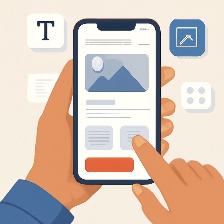
Nowadays, the websites that use many times are pasted directly as website apps over the mobile screen that acts as an Android app. So, the website app icon should be made accordingly. Modern smartphones have icons over the screens, so the screen app should be designed so that it will look good over there. A website icon is equally important in that situation.
The pixels should be 100 × 100 for iOS and 192 × 192 for Android web.
For mobile website apps, the logo or icon should be in a rounded rectangular form, so when your website is clipped on the screen, it should be placed efficiently without showing any awkward looks.
Maintain brand consistency

Website icon is not only a sole representation; it’s a consistency over every platform. A brand icon is the image of that brand. The website does not exist in isolation; it works as a crucial node in every brand architecture, alongside your main website logo, typography, and UI components. An icon is the representation of a website on every single platform, so it should be manufactured in a way that defines its uniqueness in every aspect.
To maintain visual cohesion, a website should strictly be matched to the website palette. It should be according to the parameters described by the developers over the website. That means the palettes of the website and icon should match.
Ensure curves, lines, radii, and the design and geometric shapes that have been used on every single page on your website should be used now to ensure the consistency.
Website developer should also ensure that the avatar and icon should match with each other, so visitors can experience seamless recognition whenever they access them on different platforms.
Optimize asset hosting and caching.
A website developer gives their 100 percent to designing a website app, logo, and icon, but there are always situations that are dynamic. So, sometimes, the best website often gives a 404 error. Here, a web hosting services company can help. A web hosting company always takes care of why a website is not working, prevents downtime, and ensures content regularity on the page.
Correct directory placement: A website developer should place the icon in the correct place for detection.
Icons should be delivered through a fast delivery network bundled with web hosting services company.
Avoid cluttered trends and over-styling.
It is tempting to use different textures on the desktop image, but too many textured icons over the desktop image can be problematic and look unclear, as a strong website often prefers sleek and simple designs. So, too much styling and textures can affect the user perspective about a website. An image with a simple background and clear logo should be used by web developer.
Solid fill shapes: Instead of textured colours, strong gradients, a simple colour-filled shape with a nice, simple icon is a timeless design, as during any network error or if desktop pixels are low, they will still be easily visible than high-contrast textures.
Create an icon that can resonate with the theme of website making. An icon that is even hard for the user to identify the website will not work effectively for a website. So, instead of choosing a highly textured and solid design, a simple brand name initial should be added to the website icon to make it stand out loud over the platforms.
Conclusion
Website icon is not only an image; it’s a brand visibility over different platforms. This small icon anchors about the website when it is posted on the desktop screen, bookmarked on the panel, or clipped on the mobile app screen. A website icon becomes the voice of the website. A brand image is based on that thing. Here in the article, various techniques and issues have been described that should be used or prevented to make the best website.
A website developer should use a clear and simple, sleek design that includes initials of the website logo or name. Before choosing the solid colours for the website, a careful study of the website palette should be done. A lot of geometric shapes and textures should be avoided. Instead of that, a simple geometric shape that will match the website theme should be used.
FAQs
How can the logo be made simple?
A website icon renders at a microscopic scale and sometimes can be 16 × 16. In this situation, adding many details to one icon just makes it muddy and blurry.
To create the best identity, a website builder should avoid detailed illustrations or full-text images to make it sharp and clean. Too much detailed illustration looks unappealing and can affect people’s perspective about the website.
How can the icon be made simple?
A lot of geometric shapes should be avoided. Instead of that, a single geometric shape with clear, small text should be there that can elevate the style of the website.Before making a website icon, a website developer should carefully analyse the Google icon, how effortlessly it is shining, instead of being simple without any geometric confusions.
What are the disadvantages of adding too many shadows over an icon?
Instead of textured colours, strong gradients, a simple colour-filled shape with a nice, simple icon is a timeless design, as during any network error or if desktop pixels are low, they will still be easily visible than high-contrast textures.
How are adding initials of a website important in a website icon?
Website developer should use the first 2 words of the brand name in the logo, as the icon is the representation of the brand. Then it is a must that the first word of the brand name should be used in the logo, like in Google. The first letter should be written in different typographic styles and colours, instead of adding many geometric images.
How does the icon maintain consistency?
To maintain visual cohesion, a website should strictly be matched to the website palette. It should be according to the parameters described by the developers over the website. That means the palettes of the website and icon should match.
Pingback Business Profile on Google 2026: Powerful Benefits and Proven Optimization Tips - RootX Hosting
Pingback Part-Time Income from Websites: 5 Proven Ways to Earn Online
Pingback Fast Hosting but Slow Site? Understand 9 Surprising Reasons