
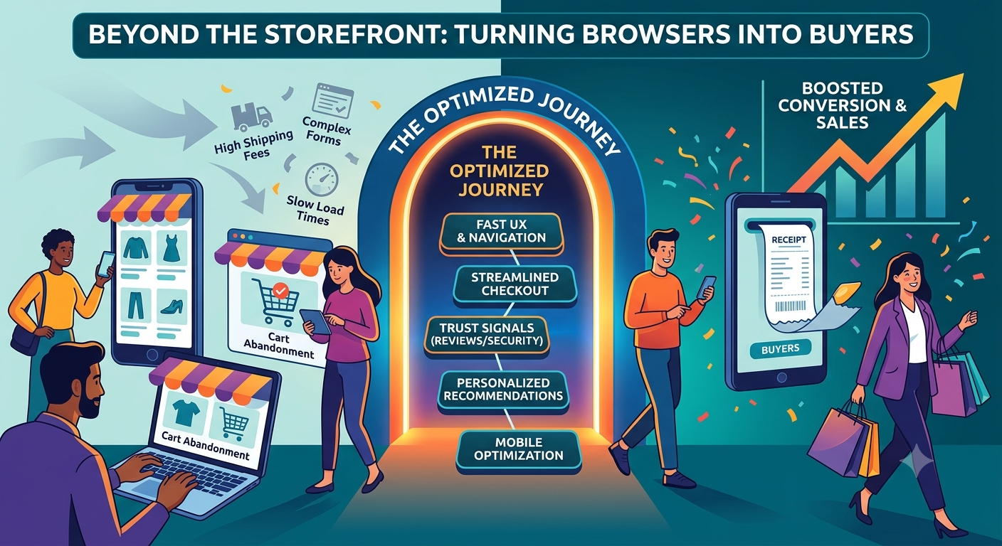


Every e-commerce website owner knows this feeling. The traffic numbers look fine. Customers are looking at merchandise in the e-commerce website, adding things to their carts, and then, for no apparent reason, leaving. No purchase. No email address left behind. Nothing. It’s the scourge of the digital marketplace, and the good news is that it’s one of the easiest problems to solve.
Here is the key point: the websites selling goods online are usually not losing the sales due to the customers’ disinterest. Usually, something happens to them so that they cannot complete their purchase, says researcher Neil Patel. Maybe the page loaded a beat too slowly. The checkout form may have requested too much information. Perhaps the page lacked trust badges or was not mobile-friendly, which is why you decided to leave out of principle. The Baymard Institute has tracked this pattern across dozens of studies, and the number holds up: the average cart abandonment rate sits just above 70 percent. Put simply, about seven out of every ten shoppers who fill a cart never actually pay for it.
So, what actually separates a store that converts from one that just racks up traffic? This article discusses the design decisions, checkout procedures, customization strategies, and trust-building elements that all combine to convert casual browsers into paying clients.
Table of Contents
The Real Gap Between Browsing and Buying
It must be important to recognize what really is the basis behind such a disparity prior to taking the corrective actions that need to be. Shoppers rarely walk away for one dramatic reason. It’s usually death by a thousand small frictions: a price that jumps at checkout, a form asking for more than it should, a mobile page that loads three seconds too slowly, or simply nothing on the page that signals the e-commerce website is legitimate.
The data backs this up. Unexpected costs: shipping fees, taxes, all the stuff that shows up at the last second are consistently named as the single biggest reason people abandon a cart in an e-commerce website, responsible for something like 40 percent of drop-offs. Making your customers register first in the e-commerce website and then only after they can buy be seen off by just a huge margin. And mobile abandonment runs noticeably higher than desktop, often by ten points or more, which says a lot about where the real friction lives these days.
None of this is cause for panic. Think of it as a map instead. The remainder of this article goes over each of these challenges in e-commerce websites and their known, testable fixes.
E-Commerce Website User Experience Best Practices
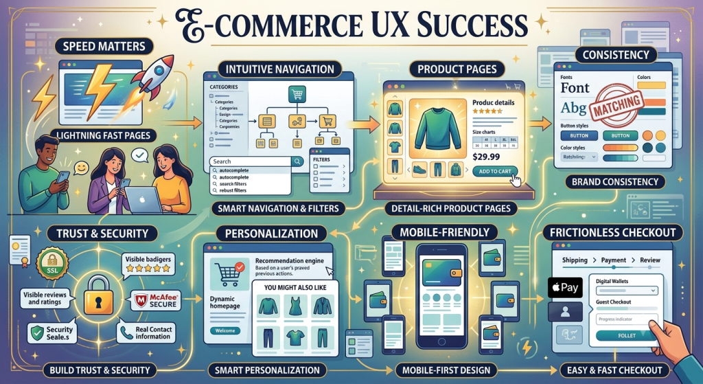
Good UX doesn’t announce itself. Nobody says, “Wow, that is a properly designed form.” after a smooth checkout. They simply make purchases. The ultimate objective is to design a buying experience in the e-commerce website that is so simple and natural that nobody ever notices.
A handful of e-commerce website user experience best practices tend to separate the stores that convert well from the ones that don’t:
Speed matters more than people think. Every extra second of load time chips away at your conversion rate, and the steepest drop-off happens in the first few seconds. Removing unnecessary scripts from your website, making sure your image files are compressed and if your visitors are, from different places, using a content delivery network or a CDP service will make your website load faster.
Navigation shouldn’t make anyone think. Category structures need to make sense to your customers, not just to whoever built your inventory system. A visible search bar with autocomplete and filters that genuinely narrow things down both go a long way toward reducing the mental effort of finding what someone wants.
Product pages should answer the question before it’s asked. This includes several perspectives on the product images, truthful sizing or specification information, transparent pricing, and sufficient specifics so that no one needs to open a support chat in order to comprehend what they are purchasing. Ambiguity is where hesitation creeps in.
Visual hierarchy should point toward action.“Add to Cart” needs to be impossible to miss, while everything secondary stays out of its way. Nothing truly wins attention if every single thing on the page has a competition for it.
Consistency builds trust without anyone noticing. Fonts, spacing, button styles, tone — all of it should feel like the same brand from the homepage through to checkout. A unexpected change, such as a checkout page that appears to be from a different website, creates a tiny doubt at the perfect time.
This is not meant to be fancy, and none of it is. Good UX gets felt rather than noticed, and it often does more for conversion than any single marketing trick you could run.
Customer Journey Mapping for E-Commerce Websites
You can’t fix friction you haven’t found yet. And that is the case for customer journey mapping for ecommerce, showing the way a customer journey progresses, that the e-commerce websites uses as awareness, consideration, decision, action and advocacy, whilst encouraging a brutally realistic view of what goes on in each stage.
Awarness the first conversation you had as you attracted that potential into your door or landed to your website when they discover your business via search, social media, pay ads or referral. At this point, your site’s job isn’t to close a sale. It is to create the initial 10-seconds impact on their side to show you’re worth considering what they’re seeking and how it relates to their search.
Consideration is the comparison stage. A visitor is reading product details, maybe checking a review or two, weighing you against a few other tabs open in their browser. This is where a good product page adds some helpful content; size chart, a comparison chart, an FAQ actually containing some information, will tell them if they stick around for longer.
Decision is the moment of truth: cart to checkout. Whatever friction still exists between “I want this” and “I bought this” either gets cleared here or kills the sale.
And purchase doesn’t really end at payment. Email order confirmations, shipping notices and how smoothly a return is executed when things go sour can determine whether the buyer becomes a repeat shopper or never returns.
However, if you chart these funnel stages with real data including actual heatmaps, analytics, and session recorded analytics, rather than estimates, it isn’t that hard to spot the leaking points very quickly. Maybe consideration is fine, but decision is bleeding customers. Maybe awareness is pulling in the wrong audience entirely. Either way, you won’t know until you trace the actual path people take and find where it breaks.
E-Commerce Website Checkout Optimization
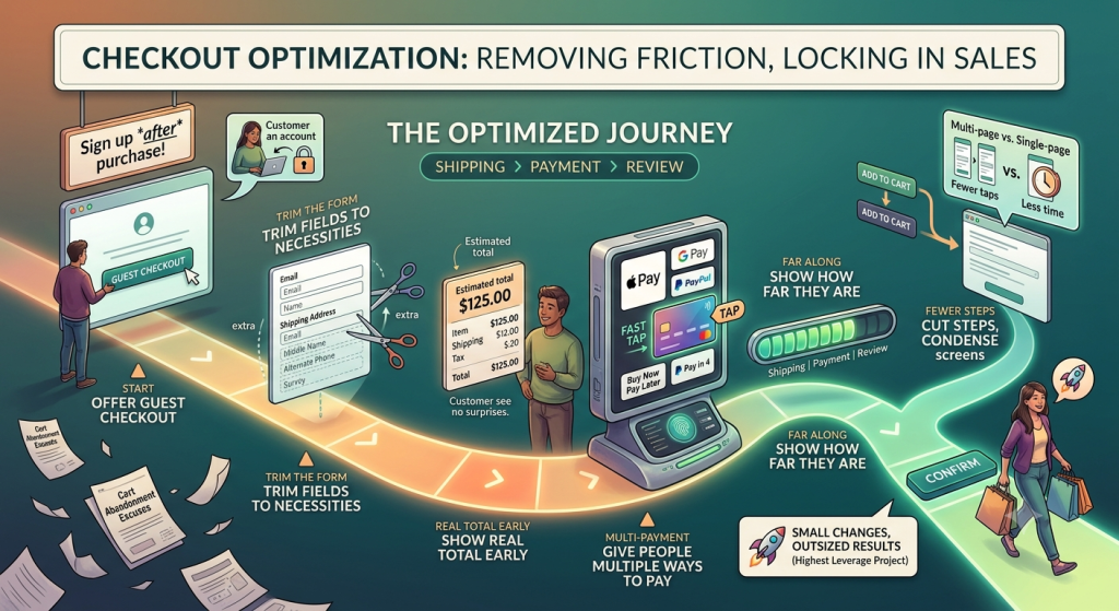
If there’s one place where small changes produce outsized results, it’s here. Checkout optimization in e-commerce website is probably the highest leverage project an e-commerce website team can do as it typically occurs after someone has committed to making a purchase. Your only remaining job is not talking them out of it.
Offer guest checkout. Making a customer to sign up just to be able to purchase is probably the best method of actually having lost them for good when they were already open and willing to close with you. Let them check out first. Invite them to make an account afterward, once the sale is already locked in.
Trim the form down to what you actually need. A study by the Baymard Institute has demonstrated that the checkout process asks significantly more fields then a simple transaction requires. Every extra field is one more small excuse to hesitate.
Show the real total early. Since surprise shipping and tax charges are the number one reason people bail, displaying an estimated total on the product or cart page, rather than hiding it until the last step, removes one of the biggest late surprises.
Give people more than one way to pay. Provide alternative payment options. Everyone wants to tap. No one wants to punch in 16 digit numbers. Digital wallets like Apple Pay and Google Pay, PayPal, and buy-now-pay-later options all lower the barrier for different kinds of shoppers, and stores offering a wider mix tend to see lower abandonment as a result.
Show them how far along they are. A clear step indicator can work, “Shipping|Payment| Review,” which will give your customers confidence in knowing they’re nearly finished with checkout. It matters more than it probably should.
Cut the number of steps. And fewer screens between “add to cart” and “confirm” means less opportunity for distraction. A single-page or condensed checkout usually beats a long, multi-page one.
None of this requires rebuilding your whole site. Those are specific, testable changes in one flow and because Checkout is your last step in the conversion tunnel, you’ll typically see the impact even when there’s only a small improvement.
Personalized Shopping Experiences in E-commerce Website
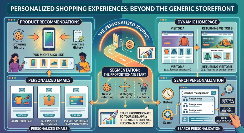
Generic storefronts are turning into a real competitive disadvantage. Many consumers today expect that the e-commerce website not only remembers their browsing history but also their purchasing history as well as recommends things that feel relevant to their needs and interests. An e-commerce website that skips all of that just reads as outdated by comparison.
You can begin reaping the benefits of personalized shopping experiences without needing a huge AI budget to begin with. Even simple tactics move real numbers:
- Product recommendations based on browsing or purchase history, the “customers who viewed this also liked” style block, are one of the most consistently effective personalization tools out there, often lifting conversion wherever they show up on a page.
- A personalized email sequence ( abandoned cart sequence, back in stock notification, previous purchase based recommendations) generally outperform their ‘one-size-fits-all’ counterparts significantly.
- No one likes seeing the same static homepage 3 times a month. With dynamic homepage content, you can make returning visitors feel welcomed and see the content that is most relevant to them.
With Search Personalization, results are silently tailored based on a customer’s past purchasing and searching behavior. This translates to no more scrolling through what they don’t want and more rapidly clicking through what they do want.
McKinsey any many other keep arriving back at the same place: most people now expect personalization and react noticeably (and irritatingly) negatively when their favourite brands fail to do so. That expectation isn’t fading anytime soon. E-commerce websites that welcome every customer exactly the same and never try to consider or understand what that particular person has already demonstrated an interest in have missed a massive amount of revenue largely by throwing away clues a customer offers free.
Start proportionate to what you actually have. It’s not like a small e-commerce website can afford to install a machine learning solution on day zero. Actually, just applying segmentation principles (e.g., dividing between new and returning customers, by interests in categories, or by what they’ve added to their cart) can provide a very large slice of the personalization cake.
E-Commerce Website Trust Signals
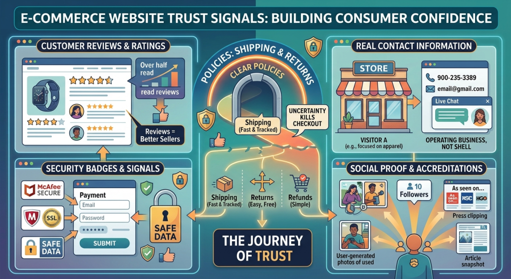
Trust goes undetected all the way up to its loss, and suddenly it becomes everything else the consumer cares about. There’s no physical storefront online, no salesperson, no chance to hold the product and check it over. Without physically seeing and meeting you and interacting with you face to face, customers just trust your website as being the medium to demonstrate that you are human.
Strong e-commerce website trust signals include:
- Customer reviews and ratings, displayed somewhere obvious. Over half of all people shopping online read reviews prior to purchasing anything, and products that have reviews are far better sellers than those that don’t. Star ratings paired with written detail tend to be trusted more than either one on its own.
- Security badges placed right near the payment fields. Showing a well-known security label right at the moment of data entry can literally reduce the friction from your customer and make them feel safer, particularly if you are a new or small e-commerce website owner.
- Shipping, return, and refund policies which are clearly visible and understandable by customers. If there’s any uncertainty about returns in case a product doesn’t work out or arrives with damages then that could be a reason to end the checkout process altogether.
- Real contact information. When you display your phone number, email, or live chat on your site, it shows that someone real, not some shell business that will pack its bags after your money clears, is actually operating the business.
- Besides ratings and comments, social proof can also be anything from photos you’ve taken, followers you’ve gained, articles written about you, or “as seen on” graphics. All of it reinforces the same message: other people trusted this brand already, and it worked out fine.
Security worries specifically are a well-documented cause of checkout abandonment. About a lot of shopper leaving is because something simply felt wrong: some random payment company you don’t recognize, no security badge to be found anywhere, some weirdly mistyped URL. That is precisely where trust signals bridge the divide.
Mobile E-Commerce Website Optimization
Mobile stopped being a secondary channel a while ago. Now it is by far the most popular traffic source and is likely the leading revenue source for many shops too. Mobile devices account for well over half of all e-commerce website sales worldwide at this point, and that share keeps growing. Skipping mobile e-commerce website optimization isn’t a small oversight anymore. This means your marketing efforts are intended to attract just some of your total target market.
There’s a nuance worth flagging, though. Most of your customers still shop through their mobiles but the purchase rate is significantly lower than desktop users. That gap usually isn’t about interest, it’s friction. Tiny tap targets, checkout forms that are miserable to fill out on a touchscreen, pop-ups you practically need tweezers to close, pages that crawl on a cellular connection: all of it chips away at sales that should have gone through.
- Design checkout specifically for thumbs, not just a shrunken version of the desktop layout. Big tap targets, auto-formatted card fields, and native autofill support all cut down on typing.
- Instead of prioritizing mobile WiFi page speed, you should really prioritize mobile network page speed. Compressed images and lean code matter even more here than they do on desktop.
- Put mobile wallets like Apple Pay and Google Pay front and center, since they let someone finish a purchase with a fingerprint or face scan instead of sixteen digits.
- Test on real devices, not a browser window resized to look like one. Real-world testing also unearths issues that simulators won’t reveal – a misplaced button beneath a notification, for example. A text input field that opens the keyboard for numbers might be another problem.
By getting mobile right, you aren’t simply fulfilling one channel requirements. So you’re tapping into the majority of the audience you want by putting the content in the one place they’re hoping to see it.
Boosting Online Sales Strategies in E-commerce Website
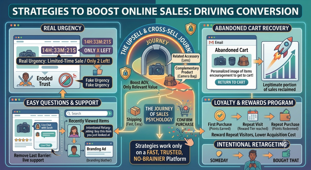
Everything covered so far is about removing friction. This last stretch is about giving people an actual reason to buy now instead of putting it off. So, here are some additional, time-tested tips to increase your online sales – all while maintaining good UX and a well-optimized checkout process:
Create real urgency, not fake pressure. Real, live, “limited-time only!” sales or “only X left in stock” notifications, and seasonal sales can certainly push a wavering shopper over the edge. Any time there’s a countdown clock that automatically rerates itself the very instant you refresh or a pop up that says there are “only two items left!” when there are actually still a million to go – that erode the trust you’re trying to cultivate.
Upsell and cross-sell, but only when it’s relevant. An effective add-on (or small variation of an existing offering), as long as you have the ability to legitimately give them relevant additional value for what they are already purchasing, can certainly increase Average Order Value (AOV) without coming off as forceful.
Go after abandoned carts. Remind that “window shopper” what they forgot via an email or text (with an image, ideally, plus some encouragement) and you can reclaim a legitimate portion of sales which otherwise are as good as lost. It’s still one of the highest-ROI moves available to any online store.
Make it easy to ask a question. Sometimes someone isn’t ready to buy for the simple reason that they have one unanswered question. Live chat or fast support access removes that last barrier.
Build a loyalty or rewards program. New customers are almost always more expensive to get than acquiring repeating ones, so using a simple points-based program helps to reward these repeat visitors instead of forcing them to have to start anew somewhere else.
Retarget with some intention behind it. Most of the time, a “buy this you just looked at” retargeting campaign wins over a “branding blather” because it follows up on what was being discussed in the previous touch.
None of these tactics work well in isolation. It is working because it’s built on a platform that’s already fast, trusted and makes checking out a no-brainier. Speed and smart retargeting can’t compensate for a cracked checkout flow, but built on top of an actually great experience, they can take a customer from “someday” to “bought that.”
Bringing It All Together
Of course, no business has the secret sauce of converting a poorly functioning window display into a revenue generating magnet overnight. What actually works is treating the whole path, from first click to final confirmation email, as one connected experience and fixing the weakest links one at a time.
The most famous E-commerce websites didn’t all achieve the fame and recognition they possess with some magic marketing bullet. The reason these people win is by creating such frictionless experiences, at every turn, and doing it in such a behind the scenes way: their UIs are fluid and logical; the checkout experience takes precious seconds and doesn’t feel condescending; their recommendations are smart (not uncanny); there’s social proof everywhere; their mobile experience is built on how we shop today.
First, take the time to chart out your customer journey more than you ever have before. Stop “assuming” to know where your customers go: Verify you are right. Then follow down the list: UX, checkout, personalization, trust, mobile and the sales psychology binding it all up and tweak each point to be the most effective it can be. That’s the whole process by which browsers become buyers, and buyers turn into the kind of repeat customers who keep a store growing long after the first sale.
FAQs
Why do so many people abandon their carts instead of checking out?
More often than not, though, it’s not one big problem but a bunch of little things happening all at once. As per the latest Baymard Institute research study, the average online shopping cart abandonment rate stands above 70% in the US and up to almost 40% of those abandons are due to some unexpected last-minute expenses like shipping and taxes. And we cannot forget that there are customers who abandon shopping carts and simply can’t tolerate having to register just to make a purchase. This situation is particularly aggravated on mobile, where carts were left abandoned almost twice as often as desktop.
What does customer journey mapping actually involve for an online store?
This involves monitoring all the way a customer interacts with you – awareness, consideration, decision, purchase and advocacy, and doing so with honest introspection as well as data analytics (heatmaps and session recordings) rather than guesswork. If the data is set up well you can then pinpoint exactly where users drop off the pipeline, such as an uninspiring product page on the consideration phase, or an inconvenient purchasing form at the decision stage.
How do we reduce checkout abandonment as quickly as possible?
A handful of changes tend to make the biggest difference: let people check out as a guest instead of forcing account creation, trim the form down to only what’s necessary, show the real total (including shipping) early instead of at the last step, offer more than one payment method, and reduce the overall number of screens between cart and confirmation.
Why do trust signals matter so much for e-commerce websites specifically?
In any order placed in an E-commerce website the customer cannot access a real shop or meet in person with the seller and touch the article so he can confirm it’s real. Trust signals like displayed reviews and ratings, security icons alongside payment inputs, clearly defined return policies and refunds, as well as legitimate contact details will often replace that absence of face-to-face guarantee; these are all thoroughly researched reasons for a customer to abandon a sale.
But if mobile drives most of the traffic, why is it that mobile has a lower conversion rate than desktop?
Because the gap is about friction, not interest. Mobile brings in the majority of visitors and an increasing share of revenue, but small tap targets, checkout forms that are painful to fill out on a touchscreen, and slow load times on cellular connections all get in the way. All but the final stretch of that margin disappears with the decision to craft a checkout experience that is fully thumb-optimized, mobile page load-first, and wallet integration (Apple Pay/Google Pay).
Leave a Reply